Allofresh is a new and growing e-groceries app and as design development goes further, Allofresh needs to have scalable design system as a foundation for sustainable product.
How i revamp Allofresh design system: Foundational overhaul
~200% faster in end-to-end project delivery
Bridged gap between design — code with semantic design token
Solidified source of truth for design and engineering
Role
Lead designer
Project scope
Design system
Introduction
Stepping into my role at Allofresh, I faced an exciting challenge that would test my years of experience in design systems: reimagining our digital product's visual language from the ground up.
💡
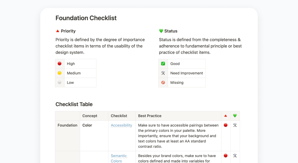
🔎 Design system audit
The first step in transforming Allofresh's design system was conducting a comprehensive audit to understand the current state and identify critical areas for improvement.
Our audit focused on three key dimensions: component inventory, user experience analysis, and competitive research.
Design system audit results
🔴Our initial discovery revealed many unique UI components spread across different files, with significant inconsistencies in implementation.
- Accessibility gaps: 60% of our color combinations failed to meet WCAG 2.1 AA standards
- Inconsistent naming conventions, spacing units, typography, and iconography implementations
- Lack of proper documentation of foundations, components, and design tokens
Takeaways
The existing design system needs improvement, which is to be expected given its early stage in development.
Solidifying the groundwork is paramount to preventing the snowballing effect of incorporating suboptimal practices into the design system.
🎨 Defining colors
It was identified that Allofresh needs to revise its color palette to address accessibility issues. Additionally, this update aims to enhance the overall user experience by mitigating the perceived 'old' feeling associated with the current color scheme.
Contrast and accessibility
Good Contrast improves the reading experience, while appropriate color contrasts help distinguish interface parts, aid visual hierarchy, and user focus.
We will use APCA as a guideline to choose our color.
Colors we want
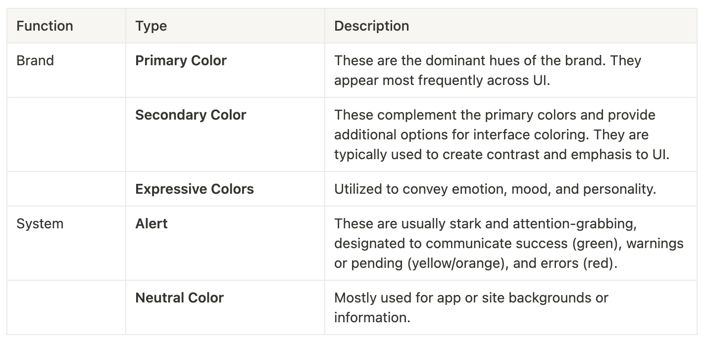
To create an effective design system, we must incorporate specific color types that serve particular functions in our user interface.
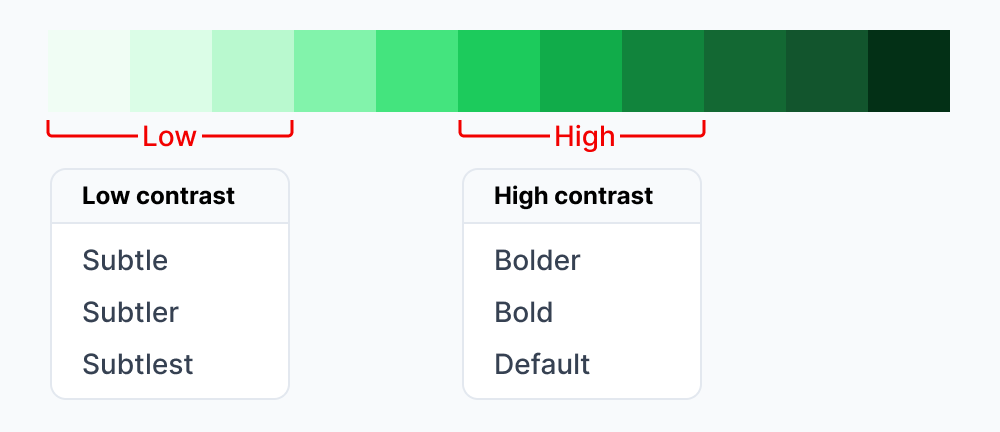
Palette color selection
To have better consistency in our UI, we're streamlining our color choices. We're basing our selection on two key principles: High Contrast and Low Contrast.
These high and low-contrast colors will pair well, offering versatile options.
Color Pairing
Each selected color in our palette will be assigned a role within the UI, either as a Background or a Foreground element. We'll then evaluate these pairings according to the APCA guidelines.
Common Pattern
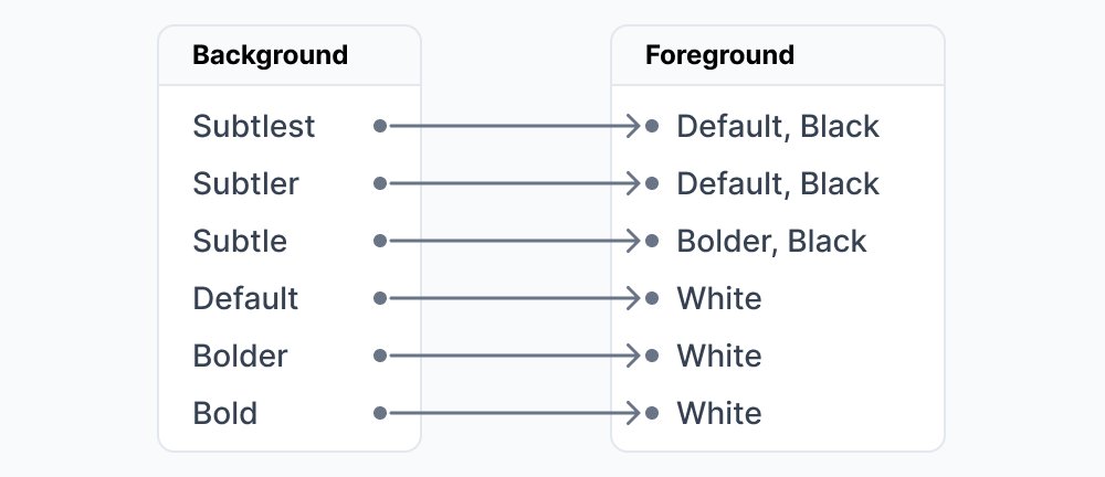
Pairing samples:
📐 Defining layout
Current layout feels a bit off-balanced—some areas are too spacious, while others feel overly tight. Improving the consistency and balance of these spaces will be essential for enhancing the overall aesthetic and usability of the design.
Spacing principles
🌟Proximity
The spacing between elements carries semantic meaning. Place more related objects closer together, and less related objects further apart.
🌟Visual Rhythm
Varying the spacing between and sizing of objects creates a more organic flow and guides the user through a page or experience naturally. This variation creates focal points and distinctions among objects on the page.
🚨 Prioritize Optical Adjustment
While a spacing system boosts consistency, it doesn't always result in a flawless visual harmony in a page. The visual weight of an element can affect the size and spacing needed to maintain balance on the page, and this might diverge from conventional spacing patterns.
Optical adjustments are necessary to rectify such imbalances and preserve the page's flow.
Border Radius
To modernize the app's aesthetics, we should increase the size of the border radius for a greater emphasis on rounded elements.
Why rounded?
| Look and Feel | Guiding Focus |
| Rounded corners are often perceived as more friendly and approachable compared to sharp. | Studies have shown that rounded corners guide the viewer’s eyes smoothly across the layout. |
✒️ Defining typography
We discovered that the existing typography system is far from perfect. It presents several pressing issues that require attention, such as unclear naming conventions and duplicate font styles under different names. The current utilization of two font families also add to its complexities.
Typography principles
🌟Prioritize Readability
Aim to help the content easily understood, enriching the user experience for individuals of all capabilities.
🌟Establish Visual Harmony
Maintain consistency and unity in typography. Employ hierarchy and spacing to diminish the cognitive effort and streamline complexity.
🌟Account for Context
Adapt to diverse preferences, conditions, & situations. Always keeping in mind how users absorb and comprehend information.
Semantic system
Given the multitude of factors influencing typography decisions - ranging from font size and weight to line height - it's crucial to implement a meaningful system in order to allow for efficient utilization of typography.
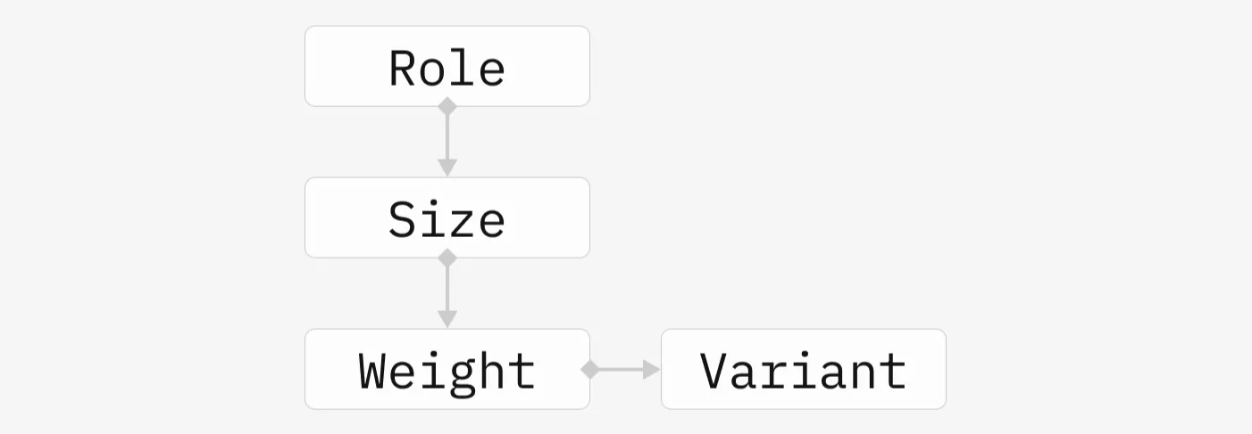
Each Role will encompass multiple sizes, all of which has different weights. Furthermore, each weights will have its distinct variant (if any).
Roles
The concept of 'Role' provides context for when and where typography should be applied, thereby assisting in maintaining consistency across the design.
…and many foundational stuffs that will be to long to explain.
🔗 Tokenization
What is a design token? (Designer perspective)
💡Design Token is a way for designer to communicate design decisions to engineer-friendly format
They are a set of variables (JSON/YAML) serves as a bridge between design and code, helping to create a consistent visual language across the products.
Type of Tokens
We will utilize semantic tokens in our hierarchy to enhance flexibility, maintainability, and scalability within our design system, in alignment with our goals for developing a new design framework. On the other hand, using only basic or component tokens may diminish those values.
Design Token Architecture
To facilitate efficient communication, we need to establish a semantic system that is both logical and easy to understand.
The Principles
| Specific Purpose | Scalability |
| Accurately reflect the intended usage of design elements. | Accommodate future design iterations and expansions. |
| Consistency | Collaboration |
| Maintain clarity and ease of use. | Alignment between design and engineering. |
Semantic System


Token
Tokens represent the basic elements or foundational concepts within a design system.
| spacing | color |
| borderRadius | elevation |
| Typography | …etc |
Role
The concept of 'Role' provides context for when and where a token should be applied, thereby assisting in maintaining consistency across the design.
Variants
Variants are the different versions of tokens within the scope of their role, encompassing a range such as functions or sizes. See architecture here
Modifiers
Modifiers are additional variations of tokens within the scope of variants, encompassing hierarchy and or states of the variants, though not every variant has modifiers. See architecture here
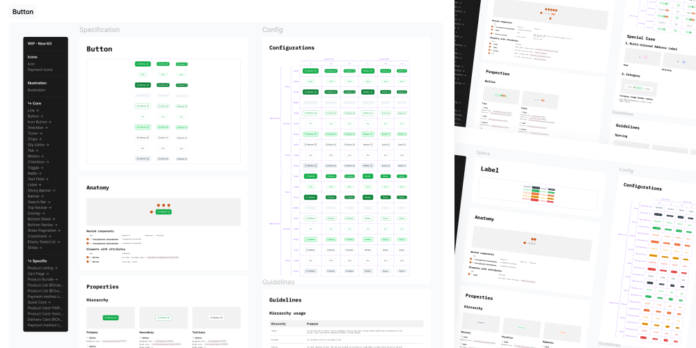
📝 Documentation
Our documentation follows a "single source of truth" approach, ensuring that designers and developers always have access to the latest, most accurate information.
✨ Summary
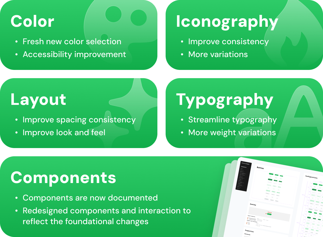
W revamped our design system with four key foundational changes. We've introduced a more vibrant and accessible color palette, implemented cohesive iconography, improved layout spacing with defined unit scaling in Figma, and streamlined typography to a single font family with varied weights.
Additionally, we've begun documenting all components, though we're still optimizing this process. The redesigned components and interactions now reflect these foundational changes, with a new design direction that emphasizes communication through shapes and colors.
Results
You've reached the end.